A lawyer is someone who is really good at persuasion, and so their websites too. They know how to play with the words to correctly pitch their thoughts. But they also need to convince their clients virtually with a creative and robust website portfolio.
But most of the lawyers took their online presence for granted and never think of giving their age-old website a creative overhaul, which is much needed in the competitive world of lawyers and attorneys.
Over the years we have seen and observed the key metrics that drive website visitors into leads. Especially for the business websites like law firms where every visitor counts. You can’t afford to leave the leaky holes in your website’s user experience.
The number one best practice that your website developer should look into mind while designing and developing the site is “Usability.” Usability is something that is very critical to any website and should never be overlooked. When you build your website oriented towards your visitors’ usability, it automatically improves the performance of the site and also the chances of your success.
Best Practices for Law Firm Websites
- Well defined goal for the website
- Appropriate and enticing CTA (Call-to-Action)
- Well formatted content
- Minimal design
- Mobile optimized web design
- Proper on-page search engine optimization
- Speak the same language in content as your buyer persona speak
- Showcase yourself as a personal brand (if possible, this brings a high trust signal for agencies like law firms)
- User-friendly navigation
- Contrasting colour combination
- High converting contact forms
- Integrating lead captures like a live chat widget
Here is my curated list of best law firm websites based on their web design, user experience, creativity, and on-page conversion metrics -
Even though I have curated this long list of top law firm websites but none of them is a complete package in the whole that I can vouch upon. The list is not in any preferential order.
YLaw Group
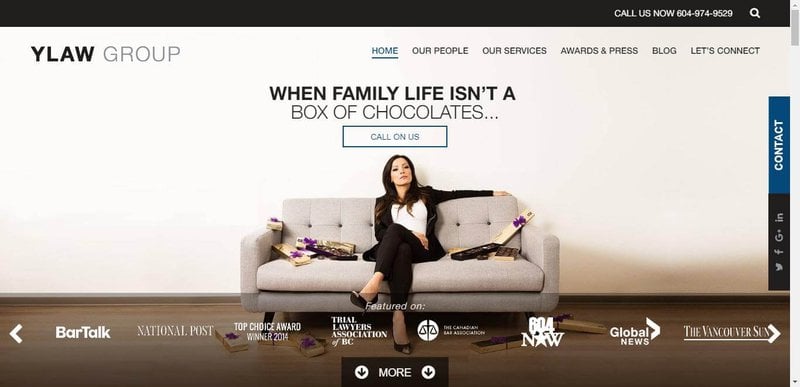
What I like about YLaw's homepage:
- YLaw is using personal images of their lawyers to win the necessary credibility in visitors' eyes and also includes the hourly rates beforehand to keep the transparency from the very beginning.
- Good use of the pictures of their previous clients including some kind words from them as their testimony.
What I would suggest:
- They can push the headshot images of their lawyers a bit upward towards the above-the-fold area of their website.
- Sometimes while scrolling the text seems too cluttered, which can be fixed by testing some more text sizes and reducing the overall width area occupied by paragraphs on the page.
Bighorn Law
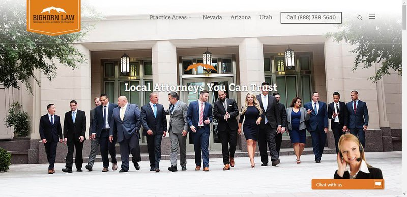
What I like about Bighorn's homepage:
- Using real and vibrant pictures gives a sense of transparency towards the agency, and Bighorn Law is using real images of their lawyers throughout the website which is a good thing.
- Have a live chat widget on their website to crack the initial conversation with their visitors.
- Eye-catching contrasting colours on the website.
- I don’t know why they didn’t include any social proof on their website. Bighorn Law is doing a decent job of optimizing its website towards conversions. But the social proof regarding some achievements, awards and most important clients' testimonials are great when it comes to driving conversions.
- SSL should be implemented
Infense
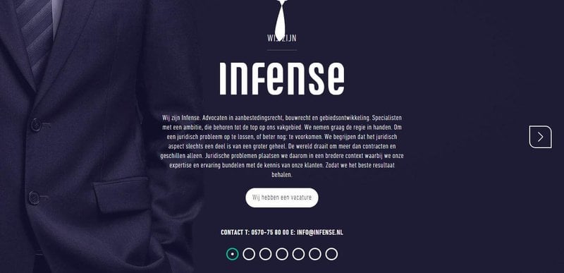
What I like about Infense's homepage:
- Enticing modern design with horizontal scrolling is looking cool on the desktop as well as on mobile.
- And they too are including their team pictures, which is again a good move.
What I would suggest:
- This chic modern design comes with its flaws, like lack of usability for visitors and added website loading time.
- I would suggest them include some client testimonials like other law firms are doing.
- Addition of an SSL certificate.
Waldon Adelman Castilla Hiestand & Prout
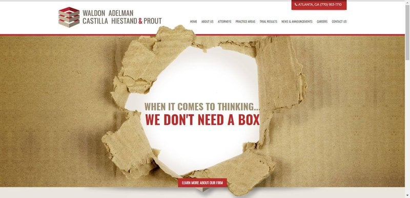
What I like about their homepage:
- Trying to give a unique perspective to their website with their attractive images.
What I would suggest:
- They should regularly conduct the A/B tests on their web pages to ensure if their unique images are working in their favour or not.
- More content should be added to the pages to make them on-page SEO optimized.
- Again, lack of social proof on their website as well.
Tremain Artaza
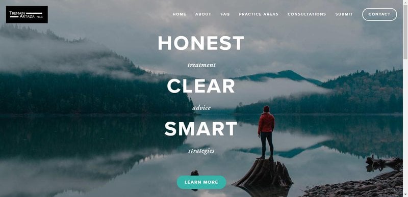
What I like about their homepage:
- Good use of awards they won right below the header image as social proof.
- Compelling content in inner pages. Especially the services pages have decent persuasive content.
What I would suggest:
- The length of the content is quite low on the homepage.
- Using stock images, which is a bad practice for business. Whenever you can, use real custom images.
- A solid call-to-action is missing from the homepage.
Horea Crisan Lawyer
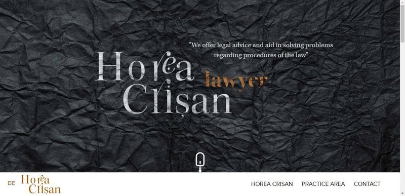
What I like about their homepage:
- Focused on personal branding which is excellent in this field. Building your face value is far superior to agency branding.
- Using sharp personal images throughout the website.
- Use of warm and soothing colours.
- The work on the web formatting is also good.
- And that customized google map in the footer.
What I would suggest:
- Lacking a clear call to action, that could direct the website visitors to take action.
- They have the potential to grow organically but aren’t leveraging search engine optimization at all.
W3IP LAW
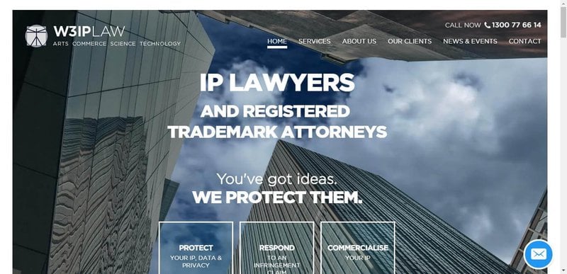
What I like about their homepage:
- They are a niche-focused law firm. When you target a specific niche with your services, you can place yourself as an authority in that field only.
- Simple yet usable navigation menu
- Well leveraging the client's testimonials.
- On-page live chat widget for quicker support.
What I would suggest:
- Too much-stretched paragraph lines are giving a claustrophobic feel on the page.
- Some more images can be used to support the offering and content on the page.
Givens Givens Sparks
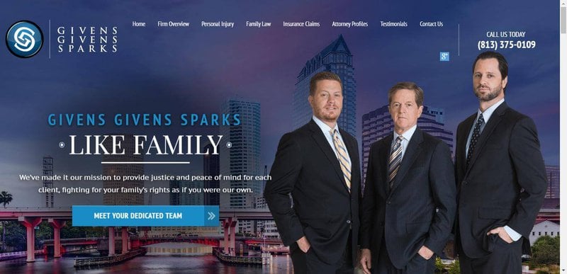
What I like about Given's homepage:
Givens Spark is one of my favourites on this list. They are doing a great job at optimizing their first-hand experience with the visitors.
- Talking about social proof, it’s right there as awards and clients' testimonials as well.
- They also have a custom video playlist near the bottom of the page.
- Word count on the page is about 2000, a sweet spot to serve the visitors with the best value and for search engine optimization too.
- Have news and blog section for all the latest news about the company and sharing informational posts around the legal things.
- A simple contact form to capture the leads, but I see more potential with an updated contact form to suit their offering. If anyone from the team at Givens Sparks reading this, shoot me an email. ;)
- Use of professional images oriented towards what they are offering.
- And the last one, On-site chat support.
What I would improve upon:
- The only thing I would like to recommend them to focus more around is 'content marketing' and 'SEO'. They have the potential to crack more leads through their website, and also their website has some decent authority.
Freshfields Bruckhaus Deringer
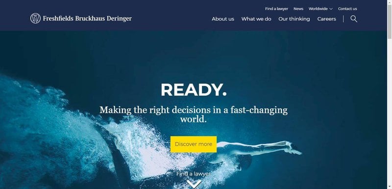
What I like about their homepage:
- I like their unique lead capture form. But it needs to be stand out. The form is blending into the design which is making it hard to recognize.
- Well flaunting their global presence.
- They have a decent website authority which is excellent for doing SEO.
What I would suggest:
- Some social proof in terms of testimonials or media presence would be an attractive addition
- Some more content can be added to support the front page offering.
Staver Law Group
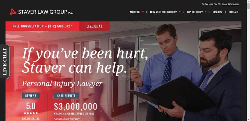
What I like about their homepage:
- Another example of a good website design that is optimized for higher usability.
- They have integrated pretty much every ingredient onto their website that is required to make an ordinary page extraordinary.
- From clients' testimonials to awards showcases, they have integrated almost all the social proofs that are required to gain credibility.
- Live chat widget.
- Niche category to gain authority in a single field of service.
- This is the first agency on my list that I recognize is leveraging content marketing quite well.
What I would suggest:
- They are already doing a solid job at their website usability and online marketing in general. I would suggest they continuously do the A/B testing on their business pages to make them better.
Quinn Emanuel
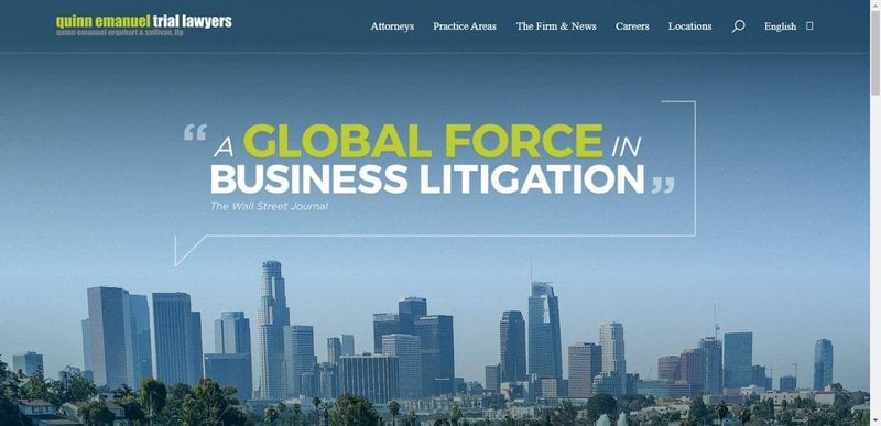
What I like about their homepage:
- Good use of colour contrasts
- Global presence with multilingual site structure
- Navigation menu
What I would suggest:
- Lack of content
- No testimonials
- Loose content marketing strategy
- No clear CTA
Arnold & Itkin LLP
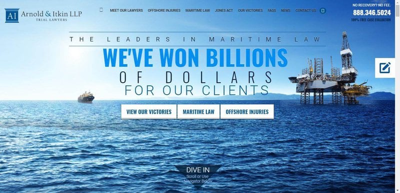
What I like about their homepage:
- Good use of the color scheme.
- Video testimonials from real clients.
- Another section of informational videos.
- Includes their faces which is good for personal branding.
- Strong CTA with 100% free case evaluation offer.
- CTA in the sticky menu bar.
What I would suggest:
- Can include live chat widget for a quicker connection with the visitor.
Gecic Law
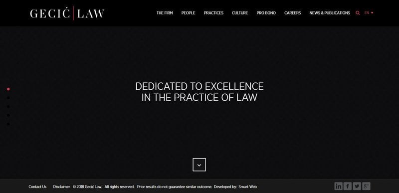
What I like about Gecic's homepage:
- The only positive thing I recognized with Gecic Law is their modern web design and multilingual support.
What I would suggest:
- Otherwise, that animation heavy web design doing bad for them rather than doing any good. Because it's increasing the load time of the site and the usability is not at par.
- They neither doing any content marketing.
- And the site is also not designed towards maximum usability.
Small Law
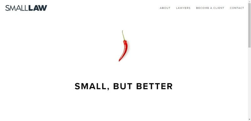
What I like about their homepage:
- They are trying to give a unique first view perspective to their visitors, which is a good thing. But this is the only good thing I see with their approach.
What I would suggest:
- Otherwise, there is lack of content on the page, almost zero content marketing efforts, no defined call to action, no social proof, no contact form or chat widget.
Fasken
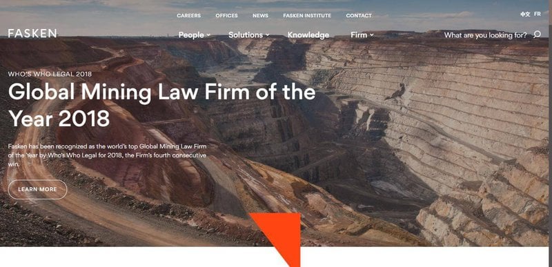
What I like about their homepage:
- A niche-focused law firm,
- Supports multiple languages based on geographic location,
- Showing real faces behind the firm,
- Continuously updating the blog section,
- Global reach,
- Decent content length on the page
What I would suggest:
- I would suggest working on an enticing CTA that can drive attraction towards submitting the contact form,
- Some testimonials should be included,
- A live chat widget can be integrated at least for the sake of A/B testing.
McCarthy Tétrault
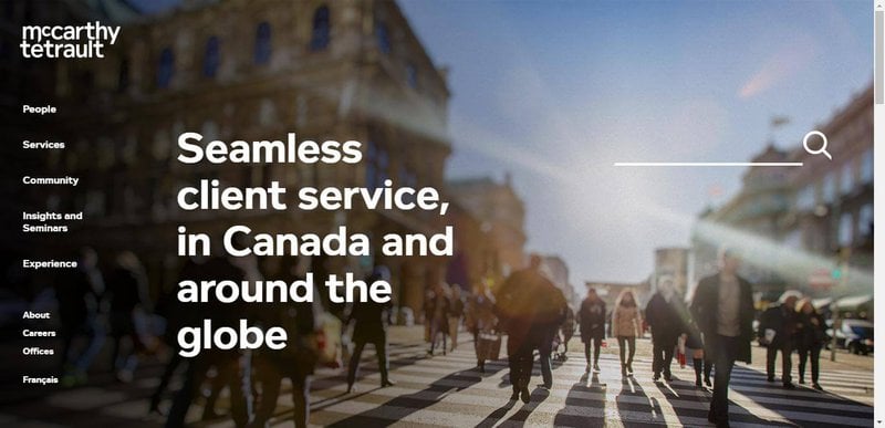
What I like about their homepage:
- Multilingual,
- Chic modern web design,
- Different looking vertical navigation menu structure,
What I would suggest:
- Lack of effective content marketing,
- Lack of content on the landing page,
- No call to action available,
- Some real faces behind the firm can be added on the website to gain some initial credibility in visitors’ eyes.
Miller Thomson
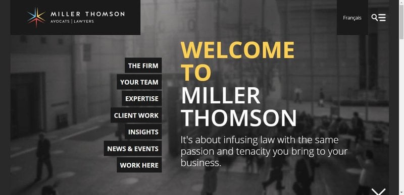
What I like about their homepage:
- Modern layout,
- Vibrant color scheme,
What I would suggest:
- Using stock images is a bad practice for businesses in the long run,
- No CTA,
- Testimonials should be included on the homepage,
- A simple contact form is missing to collect potential leads.
Egan Nelson
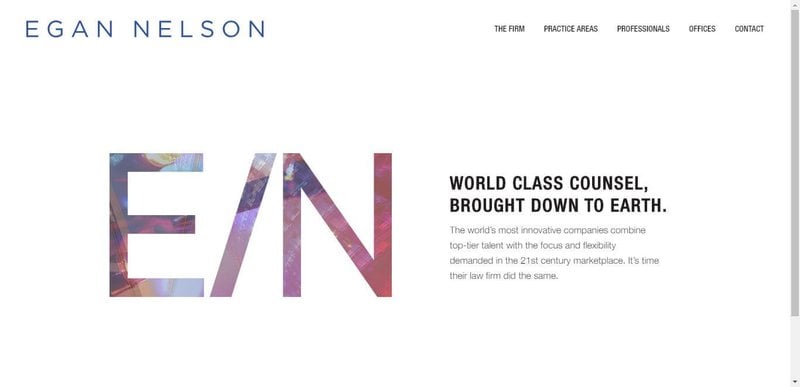
What I like about their homepage:
- They are leveraging and building their personal brand which will help them grow their face value and give returns in the long run,
- I like the minimal look too,
What I would suggest:
- But I think they made it too minimal because the page is lacking in content,
- Because of less content, the pages are not SEO optimized,
- Not using SSL which is a must after Google has started cracking down on “non-secure” websites.
- No defined CTA
Gomez Trial Attorneys
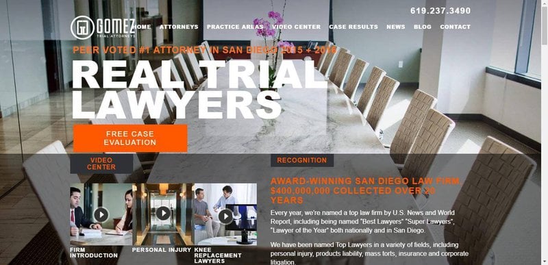
What I like about their homepage:
- Added team member faces,
- Use of warm colors on the website.
What I would suggest:
- Cluttered navigation bar,
- Dull contact form - easy to overlook,
- CTA should be strategized and designed again,
- No social proof,
- A chat widget would be a wise choice
Dawson | Orr
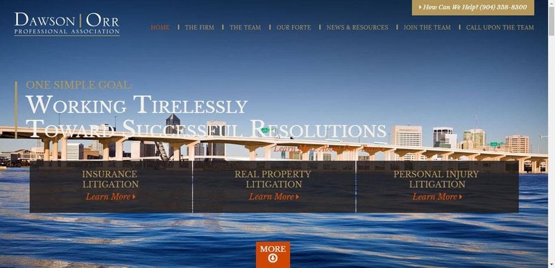
What I like about their homepage:
- Real faces,
- Strong content,
What I would suggest:
- CTA can be made better,
- Some strong testimonials are required to influence the new visitors,
- Sleazy CSS animation,
- Typography can get better,
- No SSL
Bronstein & Carmona
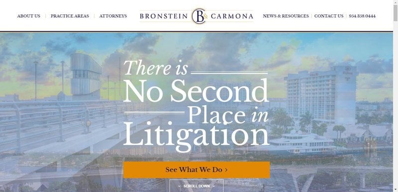
What I like about their homepage:
- Social proof in terms of awards showcase,
- Well defined practices area,
- Decent content length,
What I would suggest:
- No SSL,
- A clear CTA is required,
- Chat support,
- Not utilizing the content marketing
Jenny Odegard
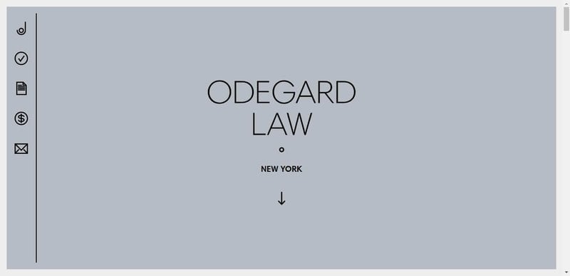
What I like about their homepage:
- Minimal yet modern design,
- A vibrant color scheme,
- Uncluttered layout,
- Well explained services section,
- Personal introduction of the founders,
What I would suggest:
- No SSL,
- Sometimes feel too much text, should be broken down into multiple paragraphs.
Shumway Van
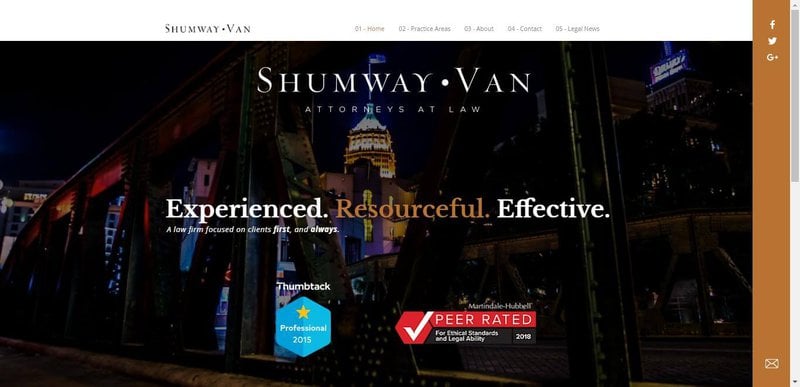
What I like about their homepage:
- Modern design,
- Simple navigation,
- Awards section,
- News section
What I would suggest:
- No CTA,
- No testimony from previous clients,