If you are looking to redesign your current association or nonprofit website, then go through the list of best association websites of 2021 I curated and reviewed below; and find out which of these best describes your expectations.
But bear in mind that beautiful design is not the only characteristic of a great website. The design is just one characteristic among others. So I would suggest you not to make the final choice considering the design alone.
With the ever-changing design trends in the web design industry; for designers, it is more important to keep up their pace closely now than ever before. Design trends are born when we 'the designers' see something unique on a website and start replicating it on other websites. If that new design element adds up to the usability/accessibility of the website, then it is adopted as the design trend.
But it is required to adopt only the best characteristics into your design; one should never compromise on the lines of usability. If an element appears good at first in terms of design but making your site less usable, then you should try to avoid that element.
I reviewed every website below with a brief description of what I like about them.
And to tell you why I’m eligible to review the sites - I hold more than five years of experience in digital marketing and specifically conversion rate optimization. So, the suggestions are not coming from a novice :).
National Parks Conservation Association
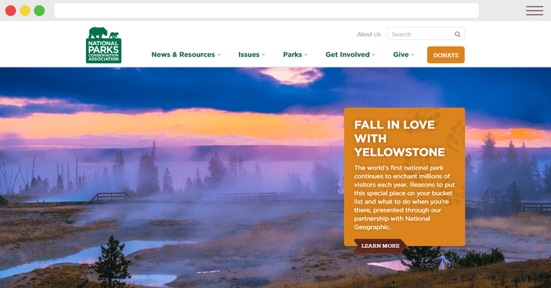
- National Parks Conservation Association’s website using a crisp and stretched header image which makes the first impression attractive and lasting.
- The search bars are placed twice on the page at the very right places. One at the top of the page and the other one in the middle with a well descriptive placeholder text that is clearly guiding the visitors in the right direction by saying “Find a park”.
- The top navigation menu is well descriptive and guided as well.
California Employers Association
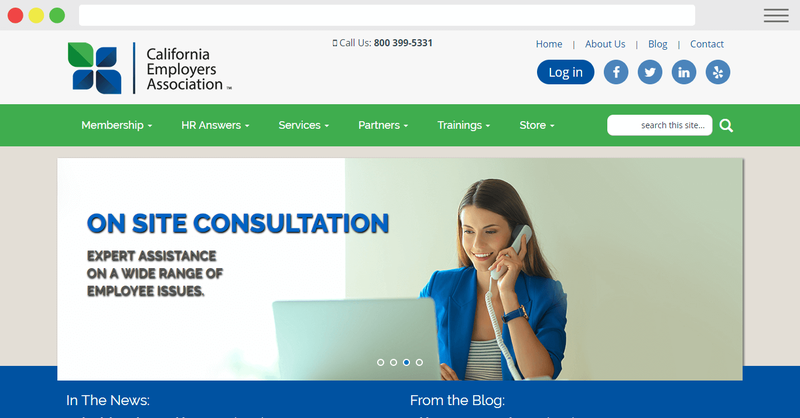
- The sticky navigation bar at the top makes the website more accessible. (But if the page is not long enough, the sticky menu bar can be disabled).
- The events calendar below the header highlighting the upcoming events is also an excellent addition to show more information interactively.
Baldwin County Association of Realtors
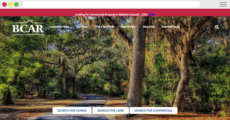
- On header: Three precise and direct call-to-action buttons to guide the users in the right direction.
- Since the call-to-action is in the above-the-fold section of the website, the conversion rate will surely be going to bump.
- Good use of work stats to show transparency and gain trust.
American Lung Association
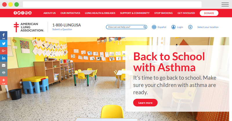
- Pretty long page with almost all the required information served from the homepage.
- Good use of real awareness images adding a sense of care.
- The footer is buffed up with almost all the required information and links to other pages.
Internet Association
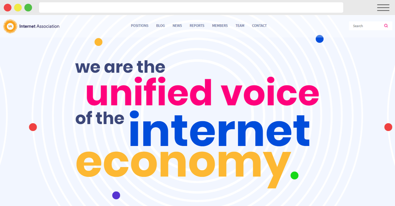
- Big, bold and coloured font headlines giving the website an overall modern look and feel.
- Interactive and CSS animated members section below the header.
- Every association website should feature its members on the homepage because its contributing members and partners make it the association. And also a big chunk of website visitors does actively look for the partnering members.
NARPP
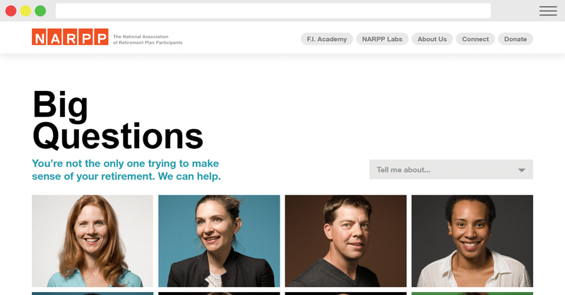
- The page is not long enough to pick up many positives but the real faces with real questions in the header of the web page giving it a feeling of trust and transparency.
The Teachers Guild
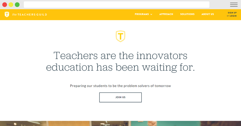
- Card-based web design is used partially to achieve a subtle look.
- The font used on the website of the Teacher’s Guild does complement their category, i.e. ‘Association’.
ALS Association
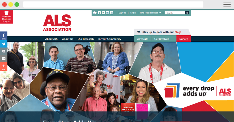
- The website is looking quite basic at first, but that doesn’t affect its usability by any means. Good navigation throughout the site and interlinked pages making the website more accessible to access and browse around.
Coastal Conservation League
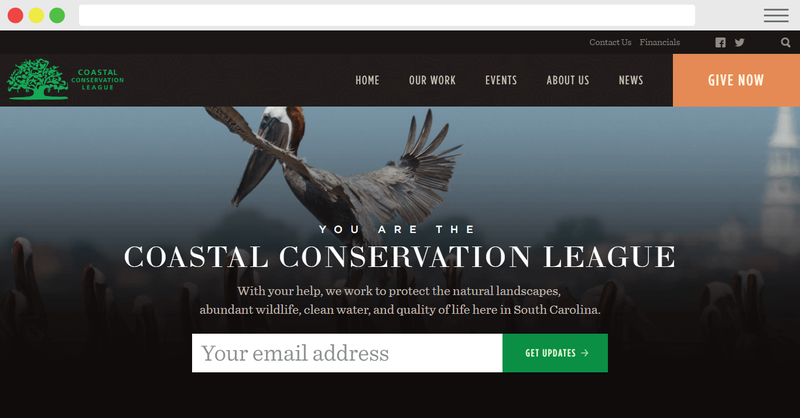
- Strategically placed big email capture form right in the above-the-fold area of the homepage.
- And that eye-catching contrasting coloured ‘Donate’ button in the floating navigation menu bar.
Mortgage Bankers Association
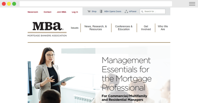
- Mortgage Bankers Association’s website is somewhat similar to ALS association as I reviewed above. Though I’m not a big fan of sidebars on the homepages, they have utilized it quite well. The layout is minimal yet highly usable.
American Chemical Society
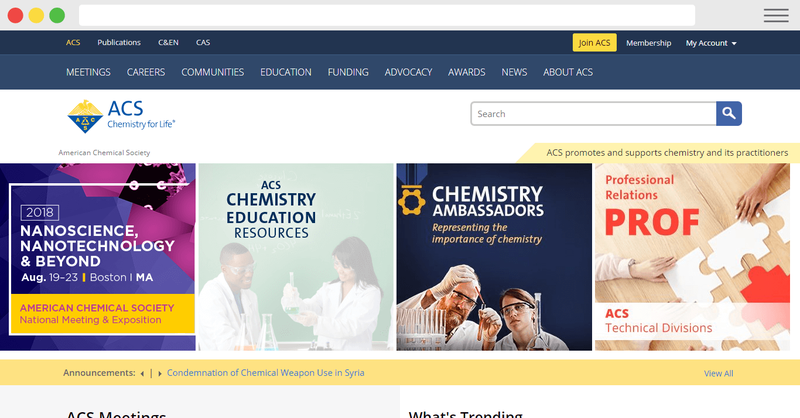
- The choice of colour is a personal pick, but the use of a more subtle colour like navy blue gives a sense of professional feel to the website. And the ACS’s web developers are leveraging that greatly.
- The suggestive search bar gives quick suggestions as you start typing your query, suggestive search bars are not easier to develop, but they do add up to the overall usability of the website.
- The length of the homepage can be made longer to make it suitable for SEO purposes and to serve more volume of information on the page.
Genium360
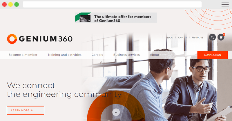
- Use of sharp colour combination to attract the eyes to the right places on the page.
- The down-pointing arrow intrigues the eye to scroll for more content below the fold.
- The professional and clean layout makes the whole page easier to skim.
AIA
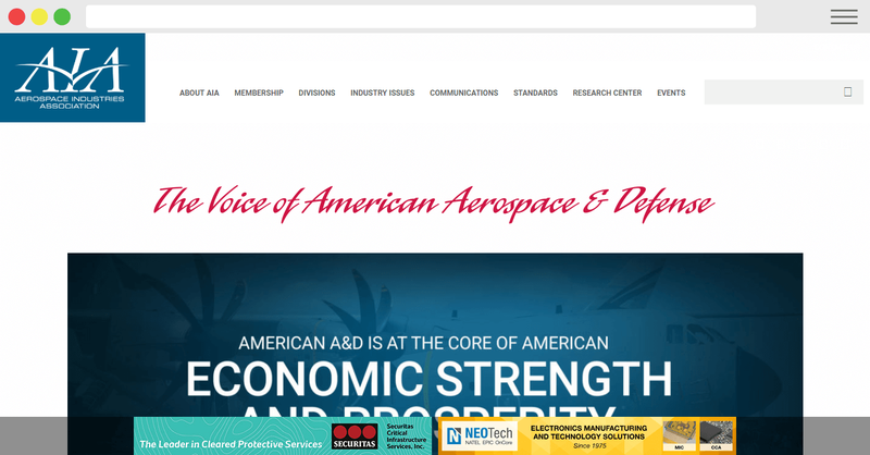
- Well laid out modern design.
- Scroll-triggered animated pictures that are giving the page a lively feel.
AVIXA
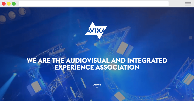
- This one is my personal favourite when it comes to the overall web design and usability structure of an association website.
- Background header video that is explaining the organization quite decently.
- The use of high-resolution images gives a crisp look on all the devices.
- Overlay gradient on images and in the footer looks slick (subjective to personal preferences).
- Sticky navigation menu with a full dropdown menu to include all the relevant pages.
Acumen
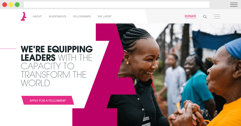
- In-sliding hamburger menu to offer more content in the collapsible sidebar.
- Descriptive ‘Donate’ button with once, monthly, and ‘other ways to give’ options.
- Real images in the header and below-the-fold.
Care
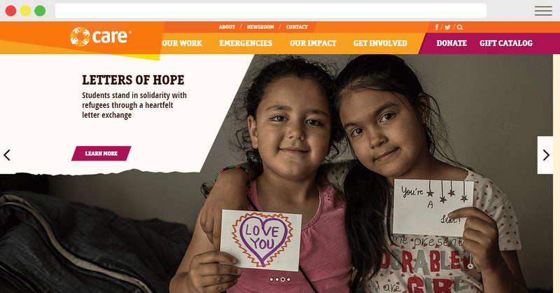
- Interactive Google map.
- Quick ‘click to donate’ form sprinkled throughout the website to improve the conversions.
- Recent social media posts integration on the page itself.
- Striking stats in numbers of what 'Care foundation' has achieved so far.
The Case Foundation
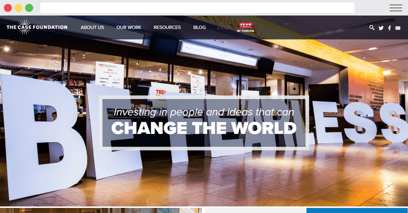
- Offering a lead magnet ebook named “Be Fearless” right from their homepage to convert visitors into leads.
- The use of real images in the header and all over the website, adding uniqueness.
Charity Water
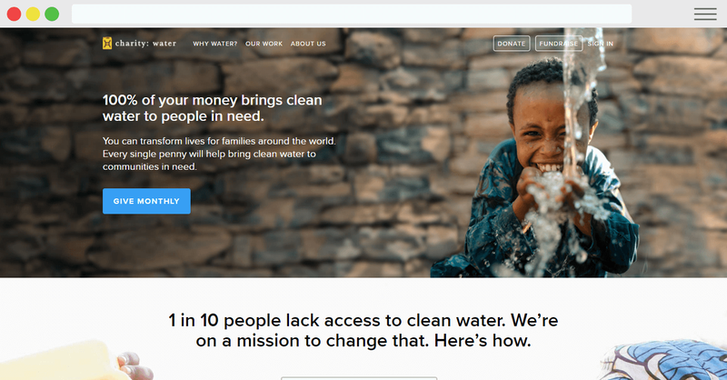
- The donate pops up on eyes really well, right in the above-the-fold area of the web page. Clear and concise call-to-action button serving a single purpose throughout the page, i.e. raising funds. On any website, the call-to-action should be made clear because when you start giving multiple choices to users with various call-to-actions on a page, he/she will get overwhelmed and bounces back.
- Powerful real video to spread awareness, though the video can also be used as header background in above the fold section.
- Bright, energetic yellow colour.
Conservation
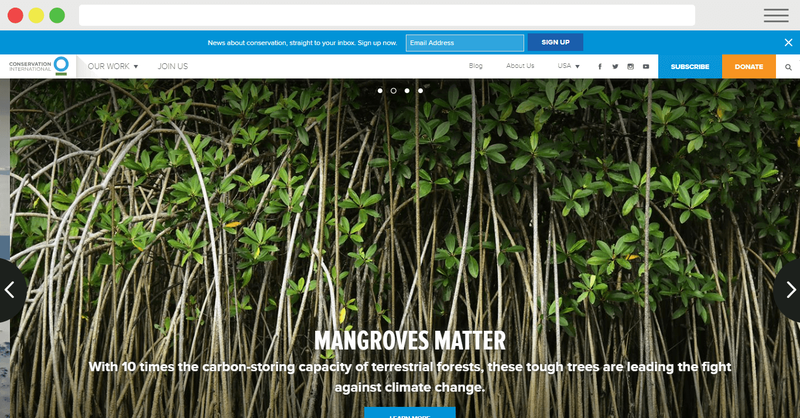
- Big drop-down navigation menu.
- Use of striking images throughout the page.
- “An important message you can’t miss” - Video footage that is describing the cause and spreading awareness.
- Updating news and blog section, which is useful for content marketing and SEO purposes.
Convoy of Hope
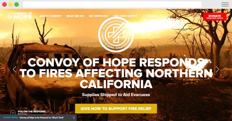
- Ken Burns effect on hero image is giving a sense of liveliness to the page without compromising with the page load speed.
- Call-to-action is placed at prominent places like the floating menu bar and on the hero image.
- Use of big and bold fonts.
- The recent news ticker is at the bottom of the header section.
Golden Triangle
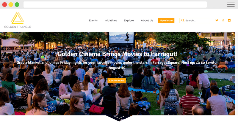
- Well laid out above the fold area with a pointing down arrow at the bottom of the hero image that guides website visitors to the next section.
- Good use of illustrated clip arts.
Goldhirsh Foundation
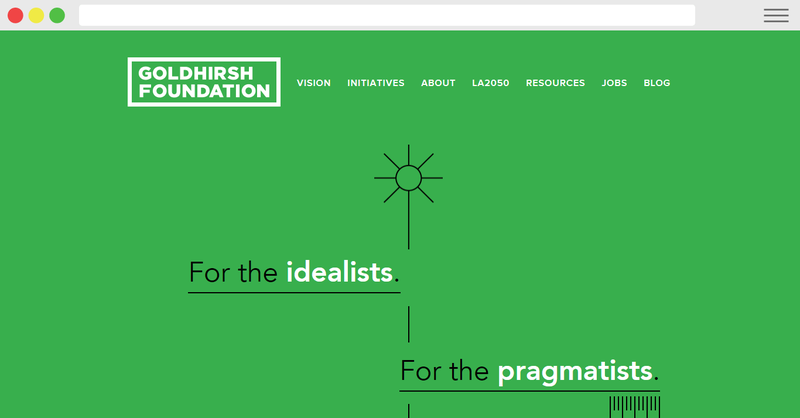
- The USP of this website is its minimal and unique design. But at the same time, to keep the page design, unique Goldhirsh Foundation is compromising with the usability of their website and the overall conversion metrics.
Malala Fund
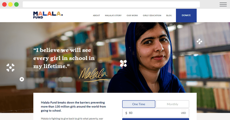
- In my opinion, this nonprofit website is working the best at utilizing the most prominent places on its website to raise funds. The donation call-to-action form is right at the bottom of the header region and hero image.
Oceana
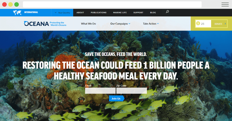
- Beautiful header area, including the coral image in the background.
- The “Join Us” form to capture visitors’ emails is placed above the above-the-fold, which gets the maximum views on any page.
- Multiple donation options in the footer area with 1-click tracking.
Freelancers Union
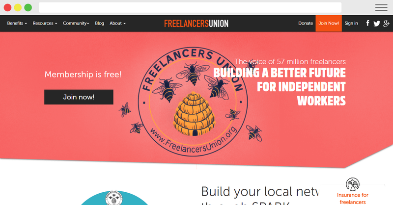
- There are not many things that I like about this association/nonprofit website. The overall design, layout and information offering could get better.
Barr Foundation
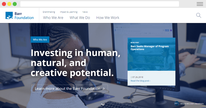
- Overall a decent web layout.
- Lack of clear directive for website visitors of where to head over or what to do after landing on the homepage.
- Soothing coloured footer section which is not harsh on eyes and gives a professional look to the website. (Why professional? Because most of the well-known and highly credible websites do use a similar colour scheme on their footer, hence this similarity brings an induced feel of trust.)
Greater Grads
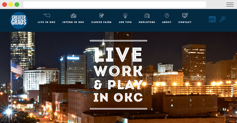
- The icons-oriented menu bar at the top making the website more accessible and quicker to navigate.
- The page could get a bit longer to serve more information to first-time visitors.
- The search button is kind of getting blending into the navigation bar colour, which is making it hard to recognize. So another contrasting colour like white for the search button could increase the number of hits on searches.